Mixed ListView Item Templates for Store Apps
This is the third article in a series describing how to solve a variety of problems I encountered while writing a real store app.
Although the app in question (Agenda View) is a phone app, everything in this article (and almost everything in the series) also applies to Universal apps and Windows store apps. In fact, I’ve built all the examples in this entry as Universal apps so that you can try them out either as Windows or Windows Phone apps.
Last time, I showed how to present groups nested within groups despite the fact that ListView supports only a single level of grouping. The trick was to use a mixture of item types, with a distinct type for items representing list headers. Each day group is a collection containing these header items interleaved with the actual appointment items, as illustrated by this annotated screenshot:
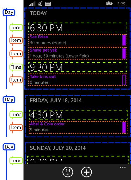
The challenge at the end of the previous article was how to display the different item types in different ways. In my simple example, both kinds of items displayed a single string, and I added some properties to my source objects to modify aspects of the appearance. This technique would not work easily in my app—as you can see from that screenshot, time headers have a completely different appearance from appointments.
What I really want is to be able to express the appearance completely in XAML. Microsoft’s other XAML frameworks have a built in solution to this: you can associate data templates with types, meaning that list controls will automatically pick item templates based on the item type. (WPF has always had this. Silverlight was rather late to the party—it took five versions, but we got it eventually.) Unfortunately, XAML store apps (for either Windows or phone) cannot do this. This is presumably partly down to the fact that WinRT is not based on .NET, so there isn’t a single definition of what constitutes a ‘type’ in XAML for store apps.
You need to roll your own solution. I came up with a few possible techniques for doing this. I’ll describe them all, finishing with the one I eventually used in my app.
Binding to Visibility Properties
My app only has two kinds of items in a day group: time group headings and appointments. (Actually, as you’ll see later, my real app eventually ended up with three. But the point is that it’s a small number.) So one way of enabling different visuals for different item types is to define properties of type Visibility on your source objects.
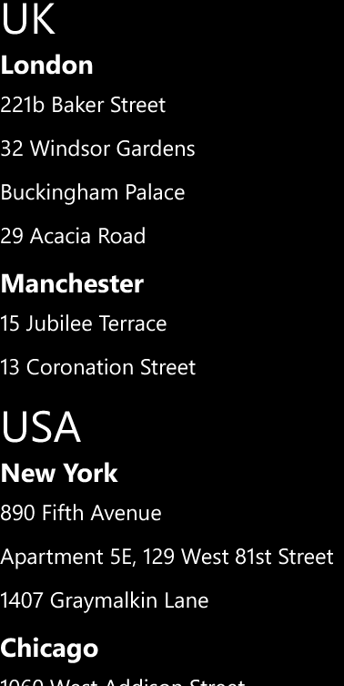
For example, in the address-based example I’m using in this series, I could modify the TownGroup to look like this:
public class TownGroup
{
    public string Town { get; set; }

    public Visibility ItemVisibility { get { return Visibility.Collapsed; } }
    public Visibility GroupHeaderVisibility { get { return Visibility.Visible; } }
}
I can add a similar pair of properties to the individual item type, SourceData, with the values reversed:
public Visibility ItemVisibility { get { return Visibility.Visible; } }
public Visibility GroupHeaderVisibility { get { return Visibility.Collapsed; } }
With these properties in place, my item template contains content for both kinds of item, and uses the properties to ensure that only the part required is shown:
<DataTemplate>
    <Grid Height="40">
        <TextBlock
            Visibility="{Binding GroupHeaderVisibility}"
            FontWeight="Bold"
            FontSize="24"
            Text="{Binding Town}" />
        <TextBlock
            Visibility="{Binding ItemVisibility}"
            FontSize="20"
            Text="{Binding Address}" />
    </Grid>
</DataTemplate>
This works pretty well, and is visually indistinguishable from the final example in the previous article:
You can download a solution containing a universal app illustrating this technique in use on both Windows Phone and Windows from here.
The main problem with this approach is that every element in the list ends up carrying both sets of visuals, meaning that the visual tree contains a lot of unnecessary weight. (Even if an item is invisible, there’s a price to pay for having it in the visual tree.) For this very simple example, it’s not a major problem, but you don’t have to add very much visual complexity before it starts to become an issue for performance (particularly on low-end devices).
In my real app, I saw a second problem. (It’s not visible in this example, and I’m guessing that’s because it uses considerably simpler item templates than the real app.) I found that the app had a much harder time keeping up with scrolling. If you scroll fast enough, eventually you’ll start seeing gaps in the list, which are filled in after a short delay, and on the low-end device I use for testing, this happened at much lower scroll speeds than with the solution I eventually used (template selectors).
I tried using this visibility property technique in a Windows 8 app a while ago, and saw yet another issue: sometimes, when scrolling quickly through a list, items ended up in the wrong mode. This seemed to be something to do with container recycling, and it looked like reused containers got stuck in whatever mode they had been in before, even if their item type had changed. I never got to the bottom of why that was—it might even have been a WinRT bug that has been fixed in a subsequent update. (This was a while ago.) In any case, I didn’t see anything similar occurring with this example.
Finally, you get a lot of binding warnings when debugging with this technique—even though the TextBlock bound to the Address property is hidden for group header items (which don’t have an Address property) XAML still reports the fact that it can’t find the property; binding is performed even for invisible elements.
So for all these reasons, this is not my favourite way to solve the problem.
Visual States
Another problem with the approach in the preceding section is that I’ve found designers don’t like it very much. It is a pain to design a single template with multiple modes driven by visibility property changes—the design tools don’t provide much help for this sort of thing. But there is a tool-supported alternative: visual states.
Visual states are normally associated with transitions that occur when something about a control changes, such as how a button modifies its appearance when you tap it. But it can also be used to define a number of different ‘modes’ for a UI element. Here’s the body of a user control that uses this technique:
<Grid Height="40">
  <VisualStateManager.VisualStateGroups>
    <VisualStateGroup x:Name="Type">
      <VisualState x:Name="GroupHeading" >
        <Storyboard>
          <ObjectAnimationUsingKeyFrames
            Storyboard.TargetProperty="(UIElement.Visibility)"
            Storyboard.TargetName="textBlock">
            <DiscreteObjectKeyFrame KeyTime="0">
              <DiscreteObjectKeyFrame.Value>
                <Visibility>Visible</Visibility>
              </DiscreteObjectKeyFrame.Value>
            </DiscreteObjectKeyFrame>
          </ObjectAnimationUsingKeyFrames>
        </Storyboard>
      </VisualState>
      <VisualState x:Name="Item" >
        <Storyboard>
          <ObjectAnimationUsingKeyFrames
            Storyboard.TargetProperty="(UIElement.Visibility)"
            Storyboard.TargetName="textBlock1">
            <DiscreteObjectKeyFrame KeyTime="0">
              <DiscreteObjectKeyFrame.Value>
                <Visibility>Visible</Visibility>
              </DiscreteObjectKeyFrame.Value>
            </DiscreteObjectKeyFrame>
          </ObjectAnimationUsingKeyFrames>
        </Storyboard>
      </VisualState>
    </VisualStateGroup>
  </VisualStateManager.VisualStateGroups>

  <TextBlock x:Name="textBlock"
    FontWeight="Bold"
    FontSize="24"
    Text="{Binding Town}" Visibility="Collapsed" />
  <TextBlock x:Name="textBlock1"
    FontSize="20"
    Text="{Binding Address}" Visibility="Collapsed" />
</Grid>
Here’s the code behind that selects the visual state based on the data item type:
public sealed partial class ListItemView
{
    public ListItemView()
    {
        this.InitializeComponent();
        this.DataContextChanged += OnDataContextChanged;
    }

    private void OnDataContextChanged(
        FrameworkElement sender, DataContextChangedEventArgs args)
    {
        string state = args.NewValue is TownGroup ? "GroupHeading" : "Item";
        VisualStateManager.GoToState(this, state, false);
    }
}
There are a couple of reasons for making this a user control. First, it acts as the scope for the visual states. And second, we need some code behind to detect data context changes and to change the state accordingly. (This is one occasion where code behind really is justified—there isn’t much point pushing this sort of code into a view model, because you’d need more work to hook it back up to the view than you saved by pushing out in the first place!)
You can download a Universal app using this technique from here.
This approach has all the same problems as the visibility property switching solution. In fact, it’s considerably worse: by introducing a user control to enable state switching, we significantly increase the weight of each list item in the visual tree. On my low-end test phone, I can see items blanking out as I scroll upwards through the list even with this simple test app, and it’s particularly intrusive with the more complex UI in my real app. So in practice, this seems noticeably worse than the previous technique. And of course, I get all the same binding errors in the debugger because this relies on the same basic idea of making one or other of the two views invisible.
The only benefit of this method is that it’s slightly easier for designers to work with in Blend.
Switching Appearance in Code
On a few occasions, I have come across suggestions that data binding is expensive in WinRT user interfaces, and that it is more efficient to set properties on UI elements directly. This has always seemed surprising to me, considering all the work that has to be done in either case. For example, layout and rendering have to happen whether you use data binding or not. These both involve a lot of work, a lot of which has to be redone far more often than data binding operations. Data binding, on the other hand, involves reading a property; how expensive can that really be?
OK, I know WinRT is a COM-based cross-language system, so it’s going to require more work than reflection-based property reads in a pure .NET environment, which are more expensive still than compiled property reads. But the latter take less than a nanosecond, so even if we’re talking 1,000 times slower for a data binding, that’s still in sub-microsecond territory, and a screen of data in my app binds to a few hundred properties. So allowing even a few milliseconds to read them all seems generous, and it’s not like they need to be read every frame—in practice, after the initial screen load you’d see maybe as many as ten property reads a second when scrolling. It’s difficult to imagine how that could be anything like as expensive as the work required to decide where every visual element goes, and how to generate instructions for rendering them in terms that the GPU will understand.
Nevertheless, it’s always a mistake to make performance decisions based purely on reasoning, because real applications have a way of surprising you. It is essential to measure performance, to see how well your theories match reality. I therefore tried modifying my real app to avoid data binding, setting properties on UI elements directly instead.
This was a lot of work, and it had no performance impact that I was able to detect. Why some people recommend this remains a mystery to me. Perhaps there are scenarios where it makes a difference, but apparently mine isn’t one of them.
Consequently, I’m not going to repeat the work for the simpler example I’ve been using in these articles; there is no download to illustrate this particular technique.
Template Selector
In the absence of classic XAML automatic type-driven template selection, the obvious way to show different visuals for different item types is to write a template selector. If you’re not familiar with them, template selectors are just objects that decide which template to use for each source item. They are tailor made for the problem I’m addressing in this article, so it’s perhaps unsurprising that I ended up using them. (But it’s good to know that it is the best of the available options.)
I could have written a selector that was specialized for my app, choosing between templates for group headers or items. But I decided to write something that I think is a bit more useful. I’ve written a selector which lets you associate templates with types. This is the exact same code that I’m using in my real app, incidentally (and I intend to reuse it, hence the XML doc comments):
// --------------------------------------------------------------------------------
// <copyright file="TypeBasedTemplateSelector.cs" company="Interact Software Ltd.">
// © 2014 Interact Software Ltd.
// </copyright>
// --------------------------------------------------------------------------------

namespace TemplateSwitching
{
    using System.Collections.Generic;
    using Windows.UI.Xaml;
    using Windows.UI.Xaml.Controls;
    using Windows.UI.Xaml.Markup;

    /// <summary>
    /// Template selector for choosing between templates based on item types in
    /// a heterogeneous list.
    /// </summary>
    [ContentProperty(Name = "Templates")]
    public class TypeBasedTemplateSelector : DataTemplateSelector
    {
        private readonly Dictionary<string, DataTemplate> _templates =
            new Dictionary<string, DataTemplate>();

        /// <summary>
        /// Gets a dictionary in which templates can be associated with type names.
        /// </summary>
        /// <summary>
        /// For each item, this selector will look for an entry in this dictionary
        /// in which the key matches the name of the item type.
        /// </summary>
        public Dictionary<string, DataTemplate> Templates
        {
            get { return _templates; }
        }

        /// <summary>
        /// Gets or sets the data template to use for items whose types do not match
        /// any of the type names in the <see cref="Templates"/> dictionary.
        /// </summary>
        public DataTemplate DefaultTemplate { get; set; }

        /// <inheritdoc/>
        protected override DataTemplate SelectTemplateCore(object item)
        {
            DataTemplate template;
            if (item == null || !Templates.TryGetValue(item.GetType().Name, out template))
            {
                template = DefaultTemplate;
            }

            return template;
        }
    }
}
Here’s the body of the main page of the Windows Phone app using this selector (and the XAML for the non-phone app is nearly identical):
<Page.Resources>
    <CollectionViewSource
        x:Key="src"
        IsSourceGrouped="True" />
    <sel:TypeBasedTemplateSelector
        x:Key="typeSelector">
        <sel:TypeBasedTemplateSelector.DefaultTemplate>
            <DataTemplate>
                <TextBlock
                    Text="{Binding Address}"
                    Height="40"
                    FontSize="20" />
            </DataTemplate>
        </sel:TypeBasedTemplateSelector.DefaultTemplate>

        <DataTemplate
            x:Key="TownGroup">
            <TextBlock
                Text="{Binding Town}"
                FontWeight="Bold"
                Height="40"
                FontSize="24" />
        </DataTemplate>
    </sel:TypeBasedTemplateSelector>
</Page.Resources>

<Grid>
    <ListView
        ItemTemplateSelector="{StaticResource typeSelector}"
        ItemsSource="{Binding Source={StaticResource src}}">
        <ListView.GroupStyle>
            <GroupStyle>
                <GroupStyle.HeaderTemplate>
                    <DataTemplate>
                        <TextBlock
                            Text="{Binding Country}"
                            FontSize="40" />
                    </DataTemplate>
                </GroupStyle.HeaderTemplate>
            </GroupStyle>
        </ListView.GroupStyle>
    </ListView>
</Grid>
As you can see, I create an instance of my template selector as a resource. Its DefaultTemplate property determines the template to use when an item doesn’t match any other template, and I’ve chosen to put my item template in there. And then you populate the body of the selector as a dictionary, associating strings with templates. The string is the simple (non-namespace-qualified) type name. (I could have used the full name, but I find the short name easier to read, and I’ve never had an app with a single list containing two elements with types with the same simple name but difference namespaces.)
So that example defines one template to use when items are of type TownGroup, and a default template to use in all other cases.
Finally, I tell the ListView to use this selector as its ItemTemplateSelector. (I’ve still got a GroupStyle to define the look of the country groups. Remember, I’m still using the built-in grouping support for the outermost groups.)
You can download a Universal app to try this technique out on either Windows or Windows Phone.
The Story So Far
The best bet for multi-level grouping appears to be to use the ListView control’s built-in grouping features for the top-level groups, and to handle nesting by having each group present a flat collection containing a mixture of group heading items and child items. The ListView is oblivious to the fact that these inner items represent nested groups—it just sees them all as children of the top-level groups. And the best way to distinguish the headers and items visually seems to be to use a template selector.
So are we there yet? Well not quite. If you run the app, you’ll see that if you scroll through it quickly on a phone, you get some occasional horizontal jiggling. It turns out that this isn’t really a grouping issue, and it’s possible to fix that while using the grouping strategy I’ve described. (I’ll show how in a later article.)
But there’s another problem lurking here. You may have noticed that with the exception of the completely unviable techniques I tried in the first article, all of my examples so far have used the same item height for both the town header and the address. (The TextElements in the templates shown above both have an explicit Height.) I can’t do that in my real app—I need the time header to be a little larger than the item to make it look like the Windows Phone 8.0 agenda view. And as I’ll describe in the next article, things go slightly wrong when you do that.
So the approach I’ve shown here is only usable if you’re OK with your nested group headers having exactly the same height as your items. (This might actually be caused by a bug in WinRT, so it’s possible that future updates to Windows Phone will fix this, but it’s a problem as of the initial release of Windows Phone 8.1. The problem does not affect Windows 8.1, because the ListView doesn’t present a sticky group header—as you’ll see, the problem seems to revolve around that feature, which is only present on Windows Phone.)
So next time, in the final article on ListView grouping (although not the final article in this series) I’ll show what I eventually did in my real app.