Why I Almost Love ClearType
I think ClearType is great. If you're not familiar with ClearType, it's a font rendering technology built into Windows XP which does two things to improve the appearance of text on an LCD. Microsoft provide a full explanation here, but here's a brief explanation:
On flat panel LCDs, each pixel on the screen corresponds to exactly one pixel in your graphics card's frame buffer. (This is not true on CRTs, where pixels are sort of circularish splats with a roughly Gaussian intensity distribution, merging in to some extent with their neighbours.) The way that LCDs show colours is to divide each pixel into three small vertical segments: a red one, a green one and a blue one. The brightness of these three elements is controlled independently, allowing any mixture of red, green and blue to be chosen for each pixel. Because of the way our eyes perceive colour, this is sufficient to span most of the gamut of colours we can see.
ClearType chooses to exploit the fact that each colour element can be controlled independently for a somewhat different purpose. Rather than using this to mix colours, it uses it to achieve more precise control over the position of what's on the screen. For example, if you want to put a pixel-sized black square on a white background, the obvious thing to do is make one pixel black. This will have the effect of switching off the red, green, and blue elements for a single pixel on screen. But you can also set one pixel to be yellow (which turns off just the blue element), and then make the pixel to its right blue (which turns off the red and green pixel). This has the same ultimate effect - you have three adjacent elements switched off, but they are 1/3rd of a pixel further to the right than the more obvious way of doing it.
So in brief, by setting pixels to funny colours, the net result on screen is not to show funny colours, but to gain more control over horizontal positioning. (As soon as you get into non-pixel-sized features, it gets a little more complex, because unless you perform some post-processing, you can get some colour fringing. ClearType uses filtering to minimize this.)
That's the main ClearType trick. The other thing it appears to do is some fairly standard anti-aliasing, which is the main cause of 'blur' that some people complain of with ClearType. If you have a sufficiently high-resolution display, this blur is completely invisible. (I'm using a 150dpi display. This is one of the benefits of the small screen size that laptops require - they end up with higher resolution than big standalone screens. Unless you can afford IBM's 200dpi standalone display...)
I really like ClearType because on my screen, text looks so much better than with ClearType disabled. (However, I don't like it so much on standalone flat panels, because they are sufficiently low-res to accentuate the blur. But that really just means that I don't like low-resolution displays...)
However, I do have one problem with with ClearType: it's better at some things than others. It works brilliantly for near-vertical features. It can accurately represent features which are nearly, but not quite vertical well, because it effectively triples the horizontal resolution. What it's less good at is near-horizontal features. Look at the following picture:
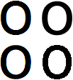
This shows four different ways of rendering the lowercase letter 'o' in 66pt Arial. On the bottom right, we have standard Windows font rendering - no font smoothing, and no ClearType, just 1 bit per pixel nastiness. It really does amaze me that some people genuinely believe that this is the best-looking of the four. But I suppose that just illustrates the rich variety of human perception...
On the top right we see how it looks with basic font smoothing enabled. Font smoothing is an older technology, which came in with Windows NT 4.0 (or then abouts). I'm not sure of the exact algorithm that font smoothing uses, but it looks pretty much like it renders it at a higher resolution, and then uses something like bilinear interpolation to reduce the image down to the screen resolution. To my eyes, it looks better than the standard image, because the edges of the font look much less rough. At the distance I usually sit from my screen, it looks slightly blurry, but not enough to be distracting. Those of you looking at a lower-resolution screen than me are likely to see more pronounced blur.
On the top left is how it looks with ClearType enabled. Looking at the near-vertical parts of the letter's shape (so the left and right sides), this looks better than the font smoothing version. I can't see any blurring at all from my normal sitting distance, and if I get closer to the screen, these edges remain crisp-looking long after I can perceive the blurring on the font smoothing version on the right.
But there's a problem with the ClearType version. Although the near-vertical edges look great, the near-horizontal edges look worse (to me) than those on the font smoothing image. Look at the very top of the letter (or the very bottom). On the font smoothed image on the right, these look as smooth to me as the vertical edges. But on the image on the left, the pixellation is very obvious, even looking at it from the distance I usually sit from the screen. ClearType doesn't help for such edges - the orientation of the red, green, and blue segments enables it to enhance near-vertical edges, but cannot improve near-horizontal edges. But what is worse is that although ClearType seems to be performing some degree of antialiasing for near-vertical edges, it performs none at all for near-horizontal ones for some reason. The result is that these edges don't look any better than the standard image on the bottom right.
So what's that image on the bottom left? That's an experimental image I built. Let's call it IanType. IanType uses much the same techniques as ClearType, except I'm not doing the clever colour filtering that is designed to reduce colour fringing, and I'm not doing anything smart with gamma. This is why the near-vertical edges don't look quite so good in IanType as they do in ClearType. (Again, perception is a very personal thing, so you might not be seeing quite what I'm seeing. I'm seeing some obvious colour fringing on the IanType example, and some slight lumpiness in the curves which I'm fairly sure are caused by the two shortcomings I described in my experimental implementation.)
However, for me, the shortcomings of IanType are barely perceptible from my normal viewing distance. And significantly, the near-horizontal lines look a whole lot better to me. They look just as good to me as the same edges in the font smoothing example. So IanType almost gets the best of all worlds. (And I think that if I actually implemented the full colour filtering that ClearType uses, and got my handling of gamma sorted, I think it really would achieve that ideal.)
I implemented this as a proof of concept after reading Robert Scoble's blog about a forthcoming interview with the inventor of ClearType. (The interview has happened now, and Scoble posts about it in this more recent item.) In the blog comments, someone accused me of not understanding how ClearType worked when I asked the question about near-horizontal features. I'm not one to take such accusations lying down, so I decide to write this prototype implementation of the feature I was suggesting.
Obviously this isn't production quality. Not only do I need to fix the colour filtering and non-linearity, it's also rather slow. (The test harness I run this in is possible the slowest-redrawing application I've written in recent memory...) But I'm hoping that either (a) someone will now explain why this technique cannot be employed in scenarios more general and useful than drawing a large letter 'o', or (b) someone will explain why my technique won't work once I've fixed the filtering and gamma issues, or (c) this will appear in the next version of ClearType.