Visual State in Silverlight Control Templates
Silverlight 2 introduces a mechanism for customizing the dynamic aspects of a control’s appearance. This new model appeared for the first time in the recent beta 2 release, so I thought I’d take a crack at explaining it.
The Role of Visual States
In both Silverlight and WPF, a control’s appearance can be customized by providing a ‘template’. Templates are typically written in Xaml, and all the usual visual elements are available. But it’s usually not enough just to define the static structure of a control’s visuals.
Most controls change their appearance when the user interacts with them. We expect elements to signal their ability to respond to input with subtle visual shifts when the mouse moves over them, for example. And this is where Silverlight’s ‘visual states’ come in. You can associate animations with visual state changes.
(If you know WPF you’ll be familiar with triggers, which enable exactly this sort of connection between interaction and visuals. In an omission some WPF veterans find surprising, Silverlight doesn’t support triggers. Visual states are what we use instead.)
States and State Groups
To work with Silverlight’s visual state system, we must get to grips with states and state groups.
A control might have many facets, each with its own visual representation. For example, a checkbox may be checked, or unchecked. And it may also be focused or unfocused. The checked/unchecked state is wholly independent of the focused/unfocused state: the keyboard focus can move into and out of the control without changing the checked state. But not all states can be freely combined – obviously a checkbox cannot be both checked and unchecked (although it might be neither – there’s a third, ‘indeterminate’ state, but that’s mutually exclusive with both checked and unchecked).
To clarify how states may combine, states are partitioned into state groups. For example, CheckBox defines three state groups:
| Group Name | States |
|---|---|
| CommonStates | Normal, MouseOver, Pressed, Disabled |
| CheckStates | Checked, Unchecked, Indeterminate |
| FocusStates | Focused, ContentFocused, Unfocused |
So if we ask “What is a CheckBox’s state?” the answer comes in three parts: a state from the CommonStates state group, one from CheckStates, and one from FocusStates. A control effectively maintains multiple state machines, one for each state group. Here are some examples:
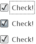
For the CheckStates state group, all three checkboxes here are in the Checked state. With respect to the FocusStates state group, the first checkbox is in the Focused state, while the second and third are in the Unfocused state. Finally, as far as the CommonStates state group is concerned, the first and third checkboxes are in the Normal state, while the second is in the MouseOver state. (The mouse cursor isn’t shown here, but you can see that the control has changed appearance.)
A control will advertise the states it offers and the group to which each state belongs with the TemplateVisualState attribute, as you can see here:
[TemplateVisualState(Name = "ContentFocused", GroupName = "FocusStates")]
[TemplateVisualState(Name = "MouseOver", GroupName = "CommonStates")]
[TemplateVisualState(Name = "Focused", GroupName = "FocusStates")]
[TemplateVisualState(Name = "Checked", GroupName = "CheckStates")]
[TemplateVisualState(Name = "Unchecked", GroupName = "CheckStates")]
[TemplateVisualState(Name = "Indeterminate", GroupName = "CheckStates")]
[TemplateVisualState(Name = "Pressed", GroupName = "CommonStates")]
[TemplateVisualState(Name = "Disabled", GroupName = "CommonStates")]
[TemplateVisualState(Name = "Unfocused", GroupName = "FocusStates")]
[TemplateVisualState(Name = "Normal", GroupName = "CommonStates")]
public class CheckBox : ToggleButton ...
We now know that a control will maintain a simple state machine for each state group. So what? To do anything useful with this, we must use the VisualStateManager class.
VisualStateManager
The VisualStateManager class lets us connect animations to state changes. It defines an attached property we can use to establish these connections in Xaml.
So that we can see this in action, let’s start with a simple template for a CheckBox:
<CheckBox Content="Check!" IsChecked="True">
  <CheckBox.Template>
    <ControlTemplate>
      <Grid>
        <Grid.ColumnDefinitions>
          <ColumnDefinition Width="19" />
          <ColumnDefinition />
        </Grid.ColumnDefinitions>

        <vsm:VisualStateManager.VisualStateGroups>
        </vsm:VisualStateManager.VisualStateGroups>

        <Rectangle x:Name="tickBox"
          Stroke="Blue" Width="12" Height="12" HorizontalAlignment="Left"
          RadiusX="2" RadiusY="2" Fill="Aqua" />

        <Path x:Name="tick" Opacity="0"
              Width="12" Height="12" HorizontalAlignment="Left"
              Stroke="Black" StrokeThickness="2"
              Data="M3,6 L5,9 9,2" />

        <ContentPresenter Grid.Column="1" />
      </Grid>
    </ControlTemplate>
  </CheckBox.Template>
</CheckBox>
This defines some pretty basic visuals – just a simple box and tick, plus a placeholder. It looks like this:

Note that although I’ve got a Path element in the shape of a tick, it’s currently invisible. Later I will supply a couple of animations to make the tick visible and invisible.
Notice that the example above already contains an empty <vsm:VisualStateManager.VisualStateGroups> element – it’s just after the grid’s column definitions. I’ve been working with Xaml for half a decade now, but for anyone who hasn’t had that pleasure, I suppose it might not be totally obvious that this element sets a property on the containing Grid! In general, Xaml elements of the form <Xxx.Yyy> denote a property. The part after the ‘.’ is the property name, so that tells us that this is the VisualStateGroups property. And the part before the ‘.’ is the name of the class that defines the property – so here we can see this property is defined by the VisualStateManager class. Again, if you’re not familiar with Xaml, it may seem a bit funky that I can set property defined by VisualStateManager on Grid, a completely unrelated class. This is an example of a Xaml feature called attached properties– they’re a way of bolting new properties onto existing types.
For some reason the VisualStateManager class isn’t in the Silverlight Xaml namespace, so we’ve had to qualify it with a namespace prefix. (I’ve chosen “vsm:” in this example, short for VisualStateManager.) For this to work, I need to have defined that prefix somewhere in my Xaml. It’s not shown in the above snippet, but I put it at the root element, alongside the other namespace declarations:
xmlns:vsm="clr-namespace:System.Windows;assembly=System.Windows"
Normally you’d let Blend do all this for you. The June preview of Expression Blend 2.5 provides new features for working with the VisualStateManager. But my goal here is to explain the underlying mechanisms, so I’ll steer clear of Blend for now.
Note: in the Silverlight 2 beta 2 preview bits, the Visual Studio Xaml editor reports an error on the line with this property. It says: “The attachable property ‘VisualStateGroups’ was not found in type ‘VisualStateManager’.” But it’s lying – the attachable property is present, and although you get what looks like an error in Visual Studio. But you’ll find the project will happily build and run despite this ‘error’, and if you close the Xaml editor, the error goes away. It’s not really an error. That’s beta software for you.
So what do we put inside this property? We can provide an animation to run for each state. On top of that, we can optionally get fancy, and provide animations that handle the transition between a specific pair of states. Let’s start with the simpler case.
Per-State Animations
The simplest way to use the visual state manager is to define an animation to run when a particular state is entered. The following example is about as simple as it gets:
<vsm:VisualStateManager.VisualStateGroups>
  <vsm:VisualStateGroup x:Name="CommonStates">
    <vsm:VisualState x:Name="MouseOver">
      <Storyboard>
        <ColorAnimation Storyboard.TargetName="tickBox"
            Storyboard.TargetProperty="(Rectangle.Fill).
                                (SolidColorBrush.Color)"
            To="PaleGreen" Duration="0:0:0.5" />
      </Storyboard>
    </vsm:VisualState>
  </vsm:VisualStateGroup>
</vsm:VisualStateManager.VisualStateGroups>
Notice that I am required to say first of all which state group I’m interested in, with a VisualStateGroup element. In this case, I’m looking at the CommonStates group. And inside the group, I provide a VisualState element for each state I wish to animate. To keep things simple, I’ve just handled one state here: MouseOver.
With this markup in place, when the CommonStates state group enters the MouseOver state (i.e. when the user moves the mouse over the control), the Storyboard I’ve supplied here will run. This particular animation changes the checkbox’s fill to pale green.
Since I’ve only handled one state, the checkbox will get stuck in that state – I’ve not yet provided any animations to put it back how it was. And I’m also missing some other states, so to complete the job, I should add the following inside that VisualStateGroup after the first VisualState:
<vsm:VisualState x:Name="Pressed">
  <Storyboard>
    <ColorAnimation Storyboard.TargetName="tickBox"
                    Storyboard.TargetProperty="(Rectangle.Fill).
                    (SolidColorBrush.Color)"
                    To="Navy" Duration="0:0:0.5" />
  </Storyboard>
</vsm:VisualState>
<vsm:VisualState x:Name="Disabled">
  <Storyboard>
    <ColorAnimation Storyboard.TargetName="tickBox"
                    Storyboard.TargetProperty="(Rectangle.Fill).
                    (SolidColorBrush.Color)"
                    To="Gray" Duration="0:0:0.5" />
  </Storyboard>
</vsm:VisualState>
<vsm:VisualState x:Name="Normal">
  <Storyboard>
    <ColorAnimation Storyboard.TargetName="tickBox"
                    Storyboard.TargetProperty="(Rectangle.Fill).
                    (SolidColorBrush.Color)" Duration="0:0:0.5" />
  </Storyboard>
</vsm:VisualState>
Note that the last of these doesn’t specify the To attribute for the animation. As is usual for animations in Silverlight and WPF, this means ‘animate back to the base value’, which is exactly what you’d hope for when returning to the Normal state.
I’m going to use a similar but cruder trick to handle the checkbox state. The following goes after the first VisualStateGroup element:
<vsm:VisualStateGroup x:Name="CheckStates">
  <vsm:VisualState x:Name="Checked">
    <Storyboard>
      <DoubleAnimation Storyboard.TargetName="tick"
                       Storyboard.TargetProperty="Opacity"
                       To="1" Duration="0" />
    </Storyboard>
  </vsm:VisualState>
  <vsm:VisualState x:Name="Unchecked" />
</vsm:VisualStateGroup>
As before, this declares that I want to handle state changes for a particular state group – the CheckStates group this time. And I’ve provided VisualState elements to tell Silverlight what to do when entering either the Checked or Unchecked states.
The Checked storyboard is slightly odd: it has a Duration of 0. This is a case of trigger envy – in WPF I’d just write a simple trigger that says when IsChecked is true, the ‘tick’ element should be visible. But Silverlight doesn’t have triggers, so instead I’ve had to use an animation that runs instantaneously to get the same effect.
The Unchecked handling is even stranger: I’ve provided an empty VisualState element. The significance of this is that I’m telling Silverlight that I care about this state, but that I have no new animations to run. And the important, non-obvious point is that when a new VisualState element comes into play, Silverlight deactivates any animations that were previously in effect from other VisualState elements for that state group.
And even though my Checked animation has a duration of 0, it remains active until we enter the Unchecked state. Animations in Silverlight (and WPF) usually continue to have an effect even after they complete – if you animate something from red to green, it will remain green once the animation finishes. (You can change that if you like – this is controlled with the animation’s FillBehavior property.) So in this case, the Checked animation completes instantly, but remains active, holding the ‘tick’ element’s Opacity property at 1 until the animation is deactivated. That deactivation happens when we enter the Unchecked state.
So it’s quite common to see empty VisualState elements. They’re usually present to deactivate any other animations for the state group.
Note that the example so far is incomplete. I’ve not handled the Indeterminate state in the CheckStates group. And I’ve also not handled the FocusStates state group at all. Nor do I plan to – I’m just trying to show the model here, and to fill in the gaps would mean more of the same.
(If you want to see a fuller example, I’ve put focus state handling into the version available for download: SilverlightVisualStateDemo.zip. If you want to run the application online, it’s up at http://www.interact-sw.co.uk/slapps/visualstate/ Note that these versions also include the feature described in the next section.)
Transition Animations
Whereas the VisualState element we’ve just seen defines the animation to use when entering a particular state, a transition animation is more specific: you can define the animation to run when transitioning between a particular pair of states.
Note that transition animations do not replace the VisualState animations. A transition animation runs before the VisualState animation. For example, suppose you’ve defined a transition animation for the transition from the Pressed to Normal states in the CommonStates group. Silverlight will first run this transition animation, and once that has finished, it goes on to run the state animation.
You might think that you could use transition animations as a replacement for state animations – why not provide only a transition, and leave out the final state animation? That turns out not to work: Silverlight requires you to specify the duration of your transition, and it will deactivate the transition animation at the end. And if you leave off the duration, the duration becomes 0 at which point the animation effectively never runs at all.
This constraint ensures that no matter how a control entered a state, and no matter which transition animation ran as a result, it always ends up looking the same when it’s in that state, once all the animations have played out.
To put it another way, Silverlight will always eventually run the animation for the target state, as specified in the relevant VisualState, but before it runs that you get to insert something specific to the preceding state. This gives you just enough power to ensure that every possible state change looks coherent, while minimizing the scope for chaos.
Here’s a simple and slightly contrived example:
<vsm:VisualStateGroup x:Name="CommonStates">
  <vsm:VisualStateGroup.Transitions>
    <vsm:VisualTransition From="Pressed" To="Normal" Duration="0:0:0.5">
      <Storyboard>
        <ColorAnimation Storyboard.TargetName="tickBox"
                      Storyboard.TargetProperty="(Rectangle.Fill).
                      (SolidColorBrush.Color)"
                      To="Red" Duration="0:0:0.5" />
      </Storyboard>
    </vsm:VisualTransition>
  </vsm:VisualStateGroup.Transitions>
  <vsm:VisualState x:Name="MouseOver">
    ... as before ...
This has a VisualStateGroup for the CommonStates group as before, but I’ve added a Transitions property. Inside this I’ve added a VisualTransition defining an extra animation to be run prior to the animation for the Normal state if we are coming into that state from the Pressed state.
So if the user presses the button down on the CheckBox, and then moves away before letting go, the check box will briefly go red thanks to this transition animation, and then the Normal state animation will run, returning the control back to its standard appearance.
Note that you are allowed to leave off either the To, or From attributes from a VisualTransition. This turns it into a kind of wildcard transition. With just a From attribute, the transition will run any time moving from the named state. With just a To attribute, it will run any time moving to the named state.
You may wonder what is the point of a transition animation with just a To attribute. What does that offer that I can’t do more easily with a normal VisualState animation? Well there is one subtle but useful difference. VisualState animations run any time a state is entered, even when the control first appears. Transition animations do not. Consider our checkbox example – you might want the tick to fade in and out rather than coming and going abruptly. You could get that effect by adding a non-zero duration to the VisualState animation for the Checked state shown earlier. However, if the checkbox happened to be checked when it first appeared, the animation would run then too, which might not be what you want. By contrast, a transition animation with To="Checked" will not run when the control first appears, but will run any time the control enters the Checked state from some other state.
You can even leave off both To and From, in which case the transition will be inserted before every state change for that state group.
Designer Support
In summary, you get to define animations that run when the control enters a particular state, and you may also define specialized transition animations that run just before the main animation. It’s certainly different from WPF’s trigger mechanisms, and while it lets you achieve a lot of the same goals, it’s not quite as flexible – you only get to write state animations for the visual states the control author has decided to offer, whereas triggers can use any property.
However, there’s one thing visual states do better than triggers: designer support. That’s not to say that WPF triggers aren’t supported by Blend – it does in fact support them. But you have to work harder with triggers. The benefit of the visual state model is that Blend can see exactly what states a control offers, and it can help a visual designer fill in all the necessary pieces. By contrast, triggers are so flexible that it’s difficult for a design tool to know where to start.
If you’re happy cranking out Xaml by hand, you’ll probably miss triggers. But if you live in Blend, visual states offer useful benefits.
Learn More about Silverlight (Gratuitous Plug)
If you want to learn more about Silverlight, Pluralsight offers a couple of courses, for which I’m a co-author and instructor. There’s our main Silverlight course, recently updated for the Beta 2 release. And we also offer a dual feature Silverlight/ASP.NET Ajax course, running for more hours in the day and for more days, in which we cover both Silverlight and also ASP.NET Ajax.